Some more on the BOM Annual Climate Report, or at least the reaction to it. Speaking on the World Today, Professor Will Steffen said this:
In terms of our coastal zones we’ve got to take seriously the issue that sea levels are rising and storm surges are coming in on a higher sea level.
The sort of thing we saw on an east coast low around the Sydney city area, they’ll become more common, so we’ll have to change our zoning planning and strengthen our infrastructure along the coast.
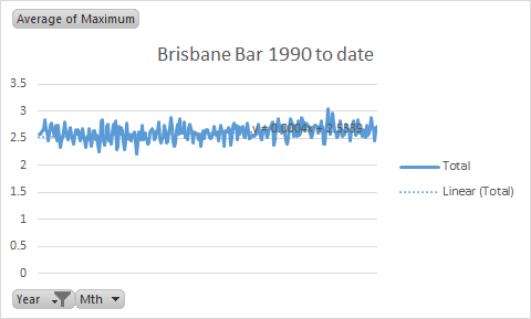
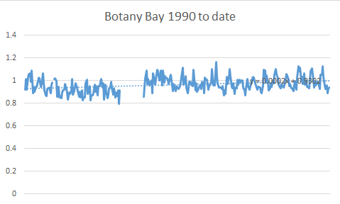
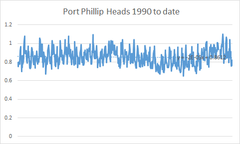
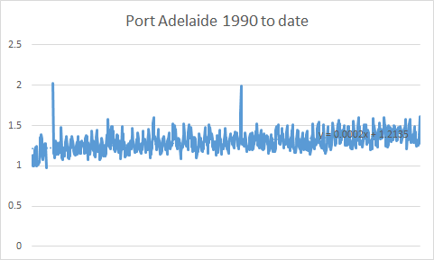
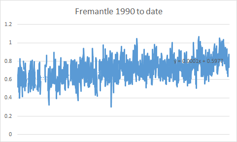
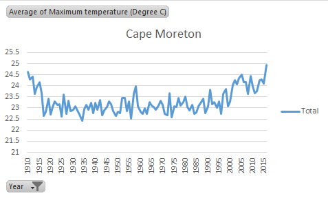
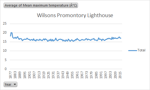
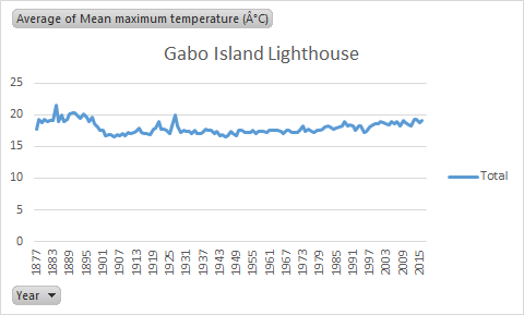
So, exactly how much are sea levels rising. Again, graphs tell the story pretty well. And the answer is, not much on the east coast, but a bit on the west. As water is more or less level wherever you are, the reason that WA is falling is that the coast is actually being tilted down as the continent runs up against the Asian land mass at the north.
This may also have something to do with the fact that there is not much evidence of sea level rise on the east coast.
But irrespective of the cause, the figures tell the story. If sea rise is either not happening, or only very slowly, then you can’t take Professor Steffen’s comments too seriously.
From comments on my previous post I expect someone will object that there is only a small number of geographical locations represented here. That doesn’t matter. The points have been chosen because they are close to large population areas, and so they are the sea level rises that most Australians experience. And as “water finds it own level” these should be very representative of what happens around a very wide area.
The equations on the graphs give you a tool for determining sea level rise on an annual, decadal or centennial basis, or any other basis you care to name. The Y axis is in metres, so 0.001 is a millimetre worth of rise in a month in the x coefficient in the equation. There is really not a lot to see here, and what you can see here is giving us lots of warning to move.
